The Power of Data Visualization: Turning Complex Data into Clear Insights
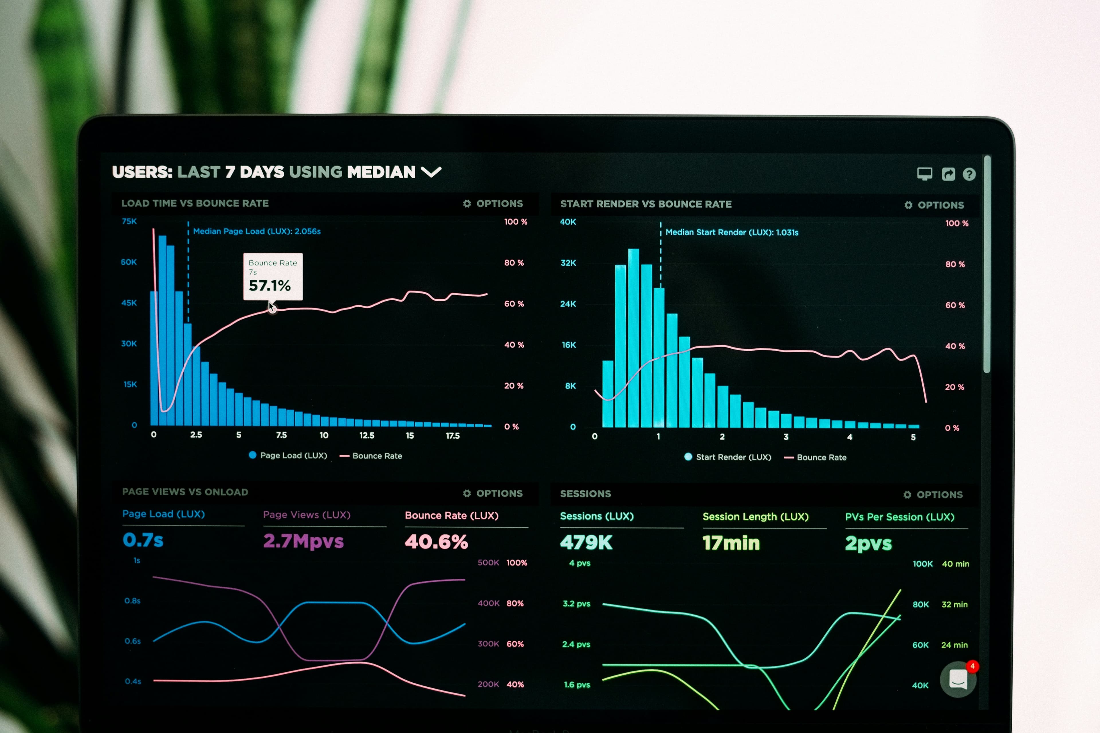
The Power of Data Visualization: Turning Complex Data into Clear Insights
Introduction
In the world of data analysis, raw numbers alone are often difficult to understand. Data visualization bridges this gap by transforming complex datasets into visual formats such as charts, graphs, dashboards, and maps.
Effective visualization allows businesses to quickly interpret trends, patterns, and anomalies without needing to dive deep into spreadsheets or raw databases.
Why Data Visualization Matters
Human brains process visual information far faster than text or numbers. A well-designed chart can communicate what hundreds of rows of data cannot. This makes visualization a critical part of modern analytics workflows.
Types of Data Visualization
1. Bar Charts and Line Graphs
These are used to show comparisons and trends over time. For example, tracking monthly sales growth or website traffic.
2. Pie Charts
Useful for showing proportions, such as market share distribution or customer segmentation.
3. Heatmaps
Heatmaps help identify intensity patterns, such as high-traffic areas on a website or sales concentration by region.
4. Dashboards
Dashboards combine multiple visual elements into a single interface, providing a real-time overview of business performance.
Applications in Business
Data visualization is widely used across industries: